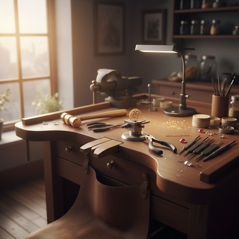
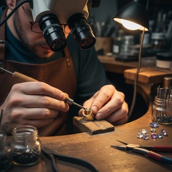
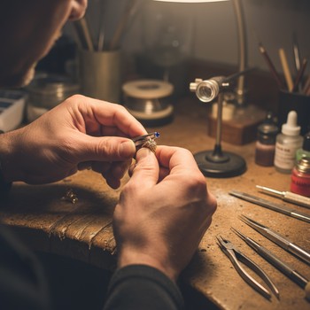
Most decisions at the bench are about how a piece will read at a
distance. We test proportions at two viewpoints: one at a glance
across the room, and one at an intimate hand’s-breadth. At the
first distance, edges blend and only silhouette remains; at the
second, small textures carry surprising weight. Both need to
agree.
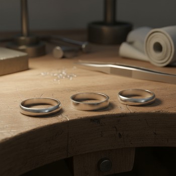
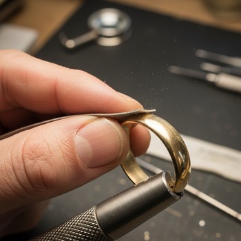
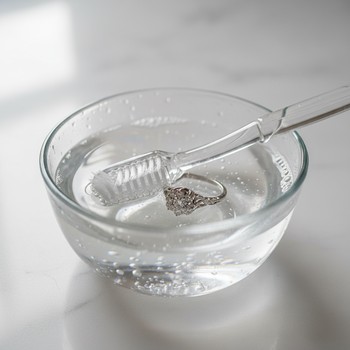
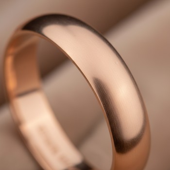
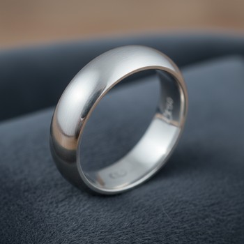
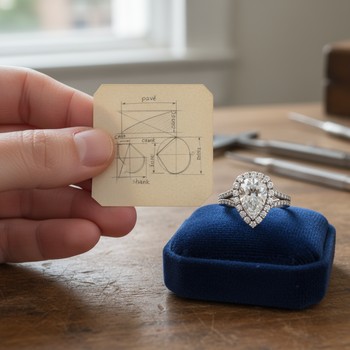
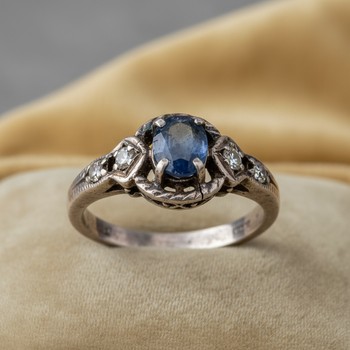
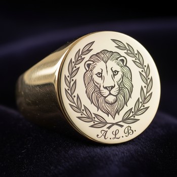
Take ring edges. A harsh corner looks graphic in photos but
becomes an irritant in life. We shift the last half millimeter
from flat to a soft round-over, and the whole gesture calms. That
tiny change reduces redness on winter days and lets the band tuck
under cuffs without catching. Comfort isn’t an afterthought; it’s
the design language the wearer feels before seeing anything else.
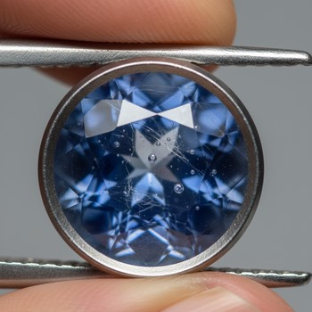
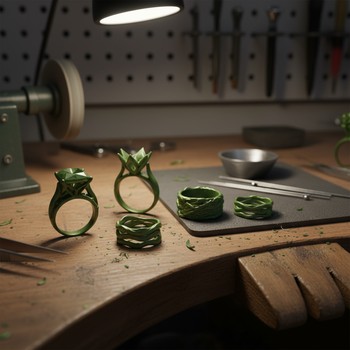
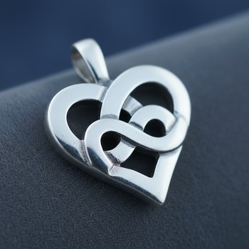
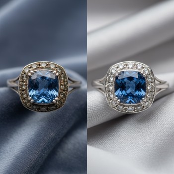
Stones tell a similar story. Step cuts trade glitter for windows
where color breathes. Brilliant cuts argue for attention; step
cuts invite a longer look. Neither is “better” — the right choice
depends on the mood you want the piece to hold when you forget
you’re wearing it. In our studio notes, we mark these moods like
tempos in music.
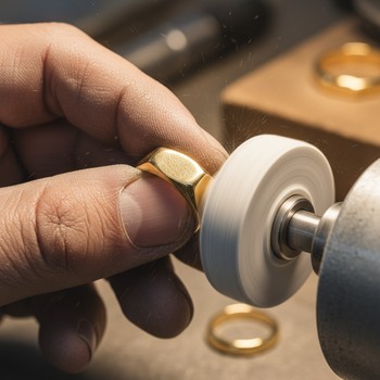
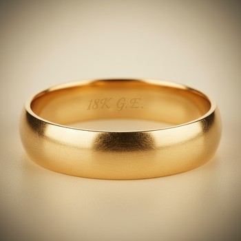
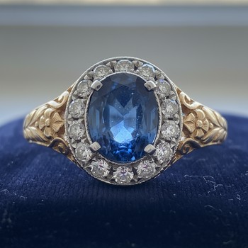
Metal finish is the quiet chorus. High polish can be thrilling,
but it turns every micro-scratch into a souvenir. A satin field
with a polished rim keeps the piece alive under city light while
aging with grace. The contrast also helps the brain read shape
quickly, which matters when jewelry is a moving subject — hands,
wrists, faces never stand still.
So we design for motion and time. We round what rubs, guard what
chips, and keep one strong line for the eye to hold. When a piece
feels inevitable on the body, the proportions are doing their job.
That’s when the glow looks unforced and the wearer moves on with
their day — until the light catches and the story starts again.